Saturday, December 1, 2007

GOINES


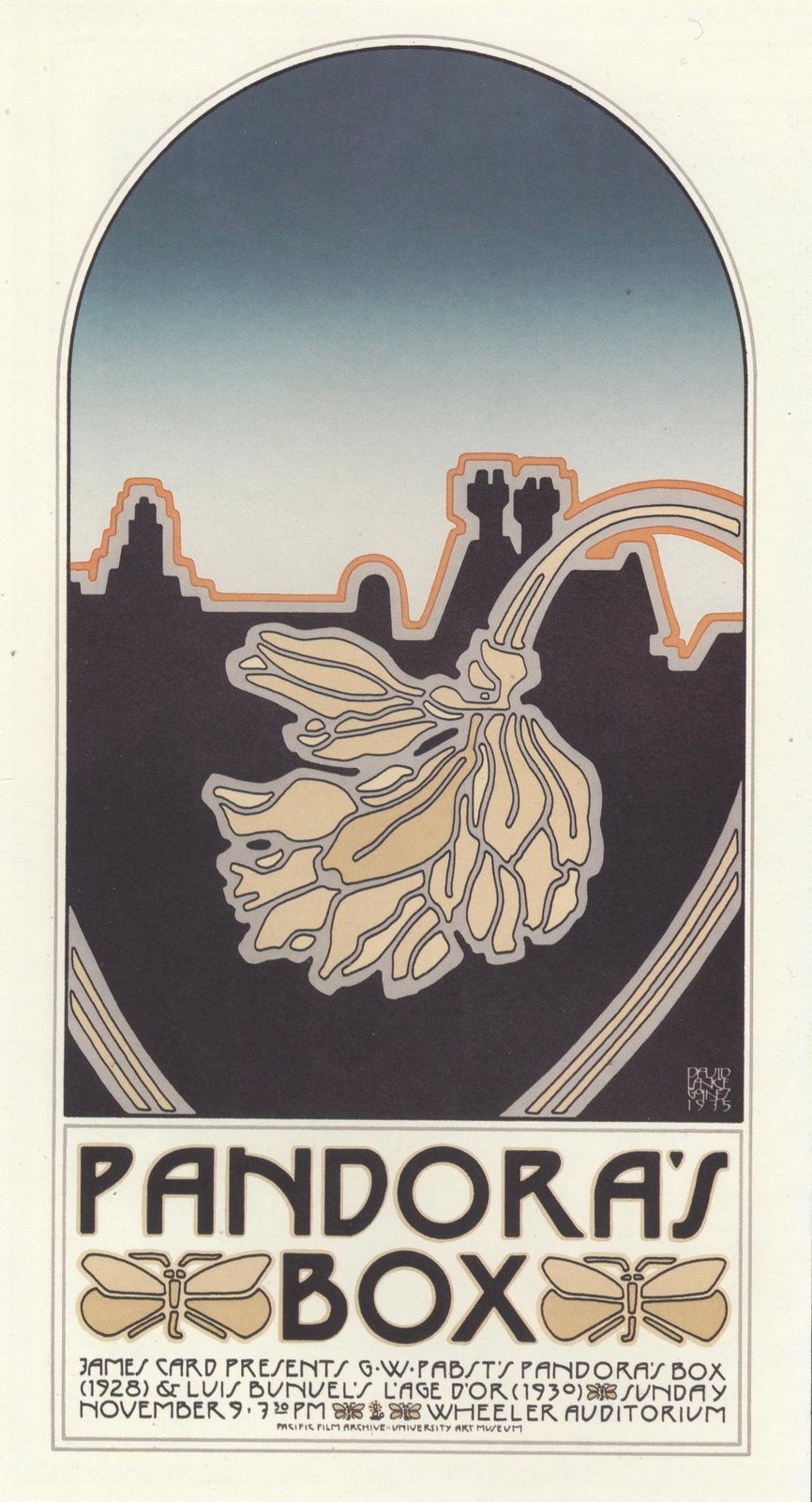
David Lance Goines started out as a student of classical languages, reading ancient texts in the original Greek and Latin. After being arrested and expelled from his university for participating in student protests in the 1960s, Goines found work as an apprentice with a nearby printer. Soon, Goines was combining his classical background with his own good taste to design posters that were both beautiful and interesting.


Goines also drew upon his classical studies in a series of witty essays (on subjects ranging from miniature golf to the Italian Renaissance artist, architect and philosopher Filippo di Ser Brunellesco).


Despite Goines' brilliance and erudition (or perhaps because of it) he had a completely unpretentious view of art, which I love. He described his work as follows:

I find it useful, when asked what I do for a living, to say that I am a printer and graphic designer, and leave it up to the questioner to decide whether or not I qualify as an artist.

* * * *

A plumber would not dare to call himself a plumber unless he were qualified in the opinion of others to do plumbing, and had experience and credentials to prove it, and actually got paid good money for his work. The same is true of an automobile mechanic, elementary school teacher or newspaper reporter. You can't just call yourself a college professor or medical doctor and expect anyone to take you seriously. You need to have something to back it up. The term "artist," unlike "electrician," or "dog trainer," neither conveys qualification, nor is it specific enough to shed much light on what a person may actually do.

* * * *

I am a competent technician. I give value for value. I am an honest workman, and I do not want people to think that I am a con-man.... therefore I do not call myself an artist. I create flat, representational objects---books, illustrations, posters, stained glass windows, greeting cards, wedding invitations, wine labels--in return for money. I'm glad that people like what I do, because that means that I can go on doing it. I like what I do, and consider it a privilege to be able to make my living doing it. But, I am not, at least in twenty-first century terms, an artist. I'll leave that to those who have no idea at all of what they do, or who they are, or where they are going, and must, for want of any other word, call themselves artists.


Goines did have his own views about the merit of different kinds of art. Here is his funny take on the "seven deadly arts:"

Just as there are Virtues and Sins; just as the Letter killeth and the Spirit giveth life, so are there Arts that prosper humanity and arts that are a pain in the neck. The Seven Deadly Arts are:

Mime
Science Fiction Poetry
Performance Art
Bell Ringing
Liturgical Dance
Experimental Film and
Decoupage


Monday, November 26, 2007

FELIKS TOPOLSKI


Feliks Topolski (1907-1989) traveled the world, illustrating the great places and events of his day.

Born in Poland, Topolski set out for adventure at an early age. He made his way to Britain, the US, the Middle East, Canada, Ireland, France, India, Australia, Italy, Argentina, Switzerland, Denmark, Norway, Germany, Brazil and Portugal. Wherever he went, he kept a visual diary of the things he witnessed. His drawings of exotic street bazaars, ancient temples and crowded cities were collected in highly popular books.


During World War II, Topolski became famous as one of the great war illustrators, working on the front lines in Russia, China, Burma, India, Palestine, Africa, Egypt, Syria and Italy. He was in London to record the Battle of Britain, and in Germany to record the collapse of the Nazi regime. He witnessed first hand the freeing of the concentration camps. Here is a wonderful detail of looters making off with plunder in the streets of Bergen:

Here is an excellent drawing of Jordanian soldiers standing guard:


He drew portraits of world leaders such as Gandhi, Winston Churchill and Bertrand Russell


One thing I particularly like about Topolski is the care he devoted to drawing people who were standing around waiting aimlessly.

Traveling under primitive wartime conditions, Topolski saw a lot of people sitting around waiting; waiting for food, waiting because transportation broke down, waiting for visas, waiting in prison camp yards... progress had come to a halt, and it seemed like most of the world spent most of its time waiting in lines.

Rather than succumb to mind numbing boredom, Topolski found the inspiration to take out his pencil and draw the people sitting around. He made thousands of drawings of such groups all around the world, but you can tell from the following examples that Topolski remained alert and observant, shrewdly capturing in line the identity and characteristics of each group.


The posture and clothing of the Russian soldiers in their thick coats look entirely different from the displaced persons, who look entirely different from the German POWs.


Those who see with the eyes of an artist, whose hand itches to draw, find opportunities for excellence even when surrounded by tedium.

Sunday, November 25, 2007

WORDS AND PICTURES

When words and pictures are combined to tell a story, one medium or the other usually ends up doing most of the heavy lifting.

Personally, I prefer art where the picture plays the central role but I acknowledge that the People In Charge of Handing Out Awards These Days seem to have the opposite view. The most honored graphic novels often combine powerful words with weak drawing.

Take for example Alison Bechdel's touching book Fun Home, Time Magazine's No. 1 Book of the Year and a National Book Critic Circle Award finalist:


Bechdel can write about an "abject and shameful mien" but she sure can't draw one. You'd never guess from these facial expressions that you are looking at a sobered person confronting a shamed person. Furthermore, her commonplace composition doesn't contribute much design or style. So perhaps we are entitled to ask: do Bechdel's drawings really enhance her words, or are they just a place holder enabling the reader to fill in the gap with his or her imagination?

Another example of the emphasis on words over pictures is Art Spiegelman's pulitzer prize winning Maus-- again, a powerful story accompanied by weaker drawing.


As with Bechdel's drawings, Spiegelman's facial expressions are either simplistic or blank. His figures are often stiff and static,and nothing in the staging of this drawing adds depth or profundity to the story already being conveyed by the words.

The same is true of the widely acclaimed "masterpiece" of the graphic novel, Chris Ware's Jimmy Corrigan. Ware correctly acknowledges, "as individual drawings [his work is] pretty bad."

Each of the pictures above tries to reduce a dysfunctional relationship between parent and child into a line drawing. To see what we are missing, look at how the same subject is handled in drawings from lowly MAD magazine. These pictures by Mort Drucker never won a prize or even merited a review, yet Drucker employs a whole collection of visual tools that are far beyond the reach of Bechdel, Spiegelman or Ware.

Note how the pictures enhance the words. This picture is drawn from an angle, looking down on the oppressed kid to make him even more diminutive; note the thick coarse line used to draw the abrasive father, the exaggerated shoulder and immense paw holding a cigar butt; and most of all, note the psychological insight in the marvelous facial expressions. This drawing reflects a lot of thought, effort and talent that are utterly lacking in the pictures above.


Here's another traumatized kid being manipulated by a parent. Once again, the expressions are perfect. Note how the parent leans forward and the kid cowers, looking back over his frail shoulder.


Here's a hilarious glowering mother hunched over the kitchen sink doing chores that her disrespectful daughter dismisses with a wave of her hand.


More body language: clasped hands, weary head in hand and raised eyebrows.


One last example: this picture shows how the angry mother has intimidated both the son and the father. They have furrowed brows and heads shaped and tilted to convey their weakness, as the mother's head and finger thrust forward into the picture.

When you compare these two sets of pictures, they exhibit dramatically different talents pursuing dramatically different goals. All of these creators claim to be "artists," but Bechdel, Spiegelman and Ware practice psychology using words, while Drucker practices it using pictures.
It is hard to say whether one medium is more insightful than the other, but the wild disparity in their treatment by the critics reflects a fundamental prejudice in favor of words and a gross ignorance about pictures.

Tuesday, November 20, 2007

Pictures from Hamlet Light

A few pictures from Hamlet Light. Just so you know I've been busy.


Photos by Susana Jesus